A 20-year-old desktop platform supporting daily supplier and warehouse operations.
Operational UX · Legacy modernisation
Modernising the journeys that keep deliveries moving.
I redesigned supplier-to-warehouse scheduling for a leading UK supermarket, translating complex operational rules into more than 20 clearer journeys for planning, monitoring and amending deliveries.
Role
UX Designer
Client
Leading UK supermarket
Duration
5 months
Scope
20+ scheduling journeys
Modernise complex scheduling journeys at pace without losing critical rules or edge cases.
Validated high-fidelity prototypes, stakeholder sign-off and a structured handover to the in-house team.
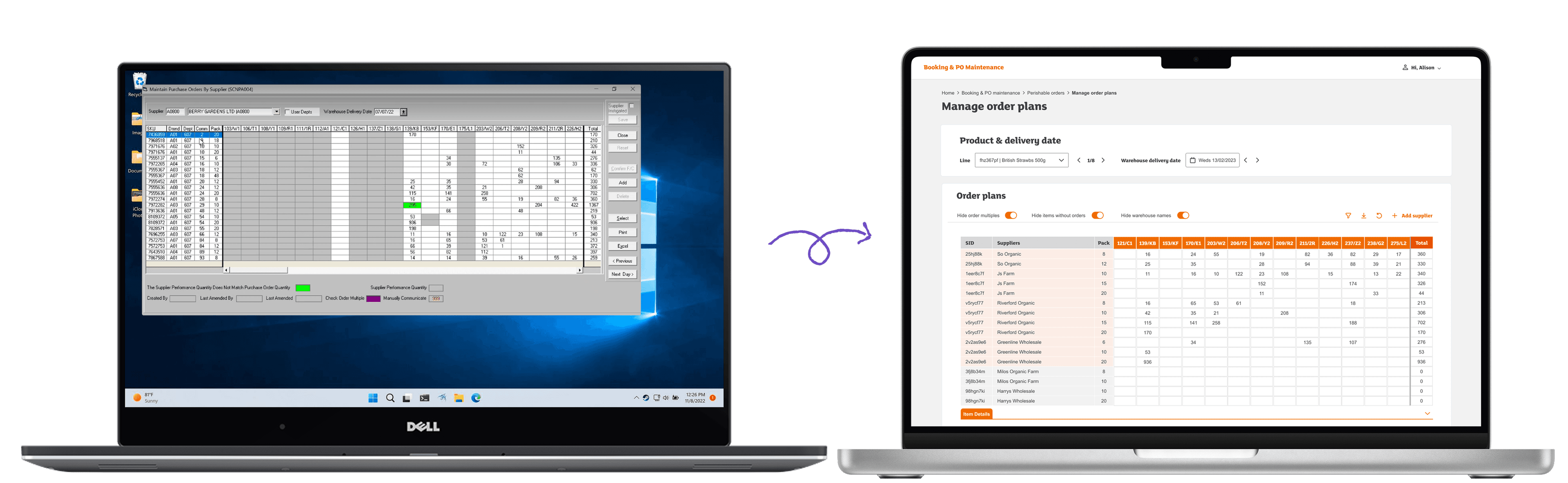
Before and after
From a dense legacy desktop tool to a clearer planning experience
The redesign introduced stronger hierarchy, visible actions, clearer filters and more usable delivery-planning controls.
Operational context
Scheduling is a network of constraints—not a calendar.
Operational teams scheduled, monitored and amended deliveries across UK warehouses. A single plan could depend on product type, handling needs, warehouse rules, capacity and available delivery windows.
The interface had to make those dependencies visible enough to support good decisions without forcing users to carry the whole system in their heads.
Operational inputs
01Product typePerishable / ambient
02Warehouse capacityDock availability
03Delivery rulesTime and handling
Plan
Tuesday · Delivery schedule3 deliveries
FreshChilled08:30Confirmed
AmbientStandard10:00Review
FrozenPriority11:30Confirmed
Design strategy
Preserve operational depth. Remove interaction friction.
Design from real scenarios
Use product, warehouse and timing conditions to shape the flow—not generic happy paths.
Make constraints visible
Surface the information users need when choosing, reviewing or changing a slot.
Validate before polishing
Confirm mapped journeys with users and BAs before committing to detailed interface work.
Live journey modelFresh produce · Tuesday plan
End-to-end delivery
Connecting supplier actions with warehouse planning
Mapping each handoff made dates, capacity, product scenarios and downstream impact visible before detailed prototyping began.Pragmatic delivery
A fast feedback loop replaced a long discovery phase.
Work directly with users and business analysts to uncover rules, pain points and exceptions.
Turn operational knowledge into journeys the wider team could inspect and validate.
Create realistic Figma flows within strict brand and component guidelines.
Present, refine and gain sign-off before repeating the cycle across the next journey.
FreshShort shelf lifePrioritised windows
FrozenHandling rulesSpecial capacity
AmbientFlexible timingStandard slots
AmendmentPlans changeClear downstream impact
Outcome
A stronger foundation for operational delivery.
Journeys redesigned across varying levels of complexity
Months of iterative design and stakeholder alignment
Coherent web experience replacing fragmented legacy patterns
Clear handover to the client’s in-house design team
Reflection
This project strengthened my ability to design pragmatically in complex environments. When a full discovery phase is not possible, close collaboration, explicit journey mapping and frequent validation become the research practice.